Five Steps to a Digital Character Illustration on Procreate
If you are new to using Procreate as a digital illustration tool for creating characters, this step-by-step guide will walk you through an easy process. I use this process for each of my characters, and I design hundreds of them!
Each of these steps can be broken down further, and expect future blog posts along those lines! But as an introductory guide to digitally creating character illustrations, this process covers all your bases. And each step uses ONLY default Procreate tools and features, so no fancy brushes or extra software is required!
Step 1: Brainstorm
We’ll talk about idea development in another post. For this example, I will use a simple idea based on one of my favourite kid’s comics, Swim Team by Johnnie Christmas. My character will be a preteen competitive swimmer.
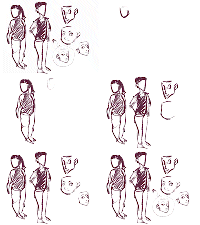
Using a chunky drawing brush (Oberon under “Drawing” in Procreate), I’ll play around with a few different body types and face types until something hits. The final face I drew, of a slightly snooty character, felt like a fun take.
Process Gif
This little gif shows (a sped up) preview of my quick-sketching, brainstorm process
Step 2: Sketch
Next, I’ll start a new canvas with the dimensions I want to work in. This is up to you, and I usually wind up modifying my final canvas as I go, but there is nothing wrong with starting with an 8.5 x 11” canvas with RGB colour space.
We’ll sketch the final character design on this file but also finish it, so work as big as you need for your purposes.
On my new canvas, I’ll use the Reference tool (under the actions menu) to have my brainstorm on the screen while I work
I like the 6B Pencil, under the “Sketching” brush menu, for my sketch layer
It’s ok if the final sketch isn’t totally cleaned up, eventually this layer will be hidden
Step 3: Line Art
Not all character illustrators outline their work, but many do! I love a nice, black outline on my work. I’ll create a new layer above the sketch layer in Procreate and turn down the opacity on the sketch layer. Now, I can trace overtop the sketch with clean linework.
My favourite tool for line work is the “Studio Pen” under the Inking category. It has a smooth finish and pressure-based size changes.
Remember to take advantage of layers! Because her goggles overlap other aspects of the design, and have a lens (transparent) and strap (opaque), I line them on a separate layer so I can easily erase out the covered portions on the layer below.
Step 4: Flat Colours
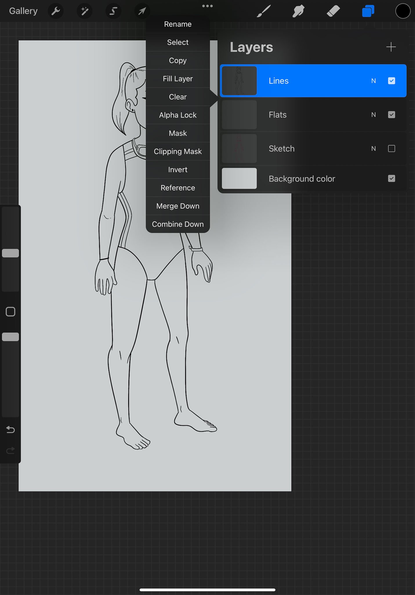
Once the line work is done, you can hide (or delete) the sketch layer. Next step, turn the line work layer to “Reference” so you can drag and drop flat colours on layers below.
You can find the “Reference” option by clicking the layer! I also make the background a soft grey so I can be more thoughtful with my colour choices (white makes everything so bright).
I like to break up my flat layers into a few big areas: skin, clothes, hair, etc. This will make shading easier.
Breaking flats into multiple layers also lets me colour the lens on the googles and then turn down the opacity, so you can see through them to the colours below.
I also add a hint of shadow below the character, just to make her look grounded
Make sure to turn off the “Reference” function on the line work when you are done with flats!
Step 5: Finishing Touches
To bring the character to life, I’ll add a bit of cel-shading and some blush. I use Clipping layers set to Multiply at around 40% opacity for shading.
What does that mean?
Clipping Layers mean that you can’t colour outside the bounds set by the layer it is clipped to. If I clip to the skin, I can’t colour out of the bounds of the flats layer for the skin tone. This means I need a shading layer for EACH flat layer.
Multiply is a layer effect that removes white from whatever colour you put on top, making any colour applied to it look like a wash of shading.
Opacity makes the layer more transparent, so the multiply layer isn’t so stark and dark!
Find the Clipping Mask option by touching a layer. Make sure the layer you want to clip to is right below it.
Change a layer to Multiply by clicking the N beside the layer (which stands for normal). This also pulls up the Opacity slider!
I like to use a deep purple, pink or red for shadows. I think it warms up the image. Of course, in a scene with background, the lighting and environment should determine the shadow and light colour.
I’m still using the Studio Pen to do my shadows.
Finally, I’ll add a bit of blush to warm up the character. I like to use another Clipping layer but this time, I’ll set it to Soft Light. That makes whatever colour you apply to the layer look like a soft glow. I’ll choose a nice, deep red and the a Soft Brush tool under the Aibrush menu and dust it over ears, cheeks, shoulders, elbows, fingers and knees.
Notice it is BELOW the shading layer, so shadows apply to the blush, too. If the blush is too much, turn down the Opacity on the layer. But I’m happy with this!
Final touch is a highlight on the hair and eyes. I use a Clipping Layer for the hair but for the eye highlight, I’ll make a layer over EVERYTHING (including Lines) and put a pure white dot on the eyes. Voila! Done!
The final character ready to go!
- March 2025
- February 2025
-
January 2025
- Jan 28, 2025 Illustration for Beginners: Working with Basic Shapes
- Jan 27, 2025 How to Get Started in Illustration: Ten Steps for Beginners
- Jan 17, 2025 Five Reasons I Love the Character Design in Dragon Age: the Veilguard
- Jan 16, 2025 Defining Your Art Style: Five Questions to Ask Yourself
- Jan 15, 2025 Building Confidence in Figure Drawing: 5 Mindset Shifts to Overcome Fear
- Jan 14, 2025 Life Drawing vs. Photo Reference: Pros, Cons, and Best Practices
- Jan 13, 2025 Procreate vs Photoshop: 5 Pros and Cons of Each Software
- Jan 10, 2025 Mind Mapping for Artists: Turning Abstract Ideas into Tangible Concepts
- Jan 9, 2025 Observation as Inspiration: Cultivating Mindfulness to See the World Differently
- Jan 8, 2025 Overcoming Fear of Failure: Five Tips for Developing a Growth Mindset in Your Art Practice
- Jan 7, 2025 Embracing Constraints: How Limits Can Boost Your Creativity
- Jan 2, 2025 What Can You Do With an Illustration Degree? 5 Career Options
- Jan 1, 2025 Five Things You Probably Didn’t Know About Printing
- December 2024
-
November 2024
- Nov 15, 2024 Character Concepts - Brainstorming Activity
- Nov 14, 2024 Designing Characters - Three Examples from the Pros
- Nov 13, 2024 Five Tips for Successful Comic Scripts
- Nov 12, 2024 Five Steps to a Masterful Outline for Your Comic
- Nov 11, 2024 How to Get Started Making Comics: Step Breakdown
- Nov 8, 2024 Three Reasons You Should Build a Creative Community
- Nov 7, 2024 Five Essential Skills for Making a Graphic Novel
- Nov 6, 2024 Five Steps to a Digital Character Illustration on Procreate
- Nov 5, 2024 Digital vs Traditional Illustration - 4 Myths Busted
- Nov 4, 2024 Three Gesture Drawing Methods You Probably Haven’t Tried Before
- Nov 1, 2024 The Seven Key Elements of Art Making
-
October 2024
- Oct 31, 2024 Three Unexpectedly Great Illustration Resources
- Oct 30, 2024 Ten Essential Skills Every Illustrator Should Practice
- Oct 29, 2024 Top Five Procreate Tips to Enhance Your Digital Illustration
- Oct 28, 2024 Seven Things I Learned About Illustration and Art Working in the Print Industry
- Oct 25, 2024 Five Viz Media Graphic Novels That Transcend the Genre
- Oct 24, 2024 Top Five Drawn and Quarterly Comics To Blow Your Mind
- Oct 23, 2024 Top Five First Second Comics to Get Cozy With
- Oct 22, 2024 Top 5 Image Comics You Need to Read Right Now
- Oct 21, 2024 Art News 002: Foodways at the Richmond Art Gallery
- Oct 18, 2024 Six Tips for Photographing Work for Your Art School Portfolio
- Oct 17, 2024 5 Ways to Make Your Art School Portfolio More Conceptual
- Oct 16, 2024 5 Unofficial Rules of Receiving a USEFUL Art School Portfolio Review
- Oct 15, 2024 Ten Things to Avoid in Your Art School Portfolio
- Oct 14, 2024 5 Things Your Art School Portfolio Should Say About You
- Oct 11, 2024 7 Tools for Drawing Perspective Without a Ruler
- Oct 10, 2024 5 Tips to Start a Daily Drawing Practice
- Oct 9, 2024 Ten Japanese Illustrators You Should Know
- Oct 8, 2024 Meet the Art Coach!
- Oct 7, 2024 Ten Tips to Get Started with Gesture Drawing
- Oct 4, 2024 Nouns + Adjectives - a Silly Illustration Game to Spark Inspiration
- Oct 3, 2024 Five Ways to Boost Your Creativity
- Oct 2, 2024 How I Make Comic Panels in Procreate
- Oct 1, 2024 OC-tober 2024, a Month of Art Prompts
-
September 2024
- Sep 25, 2024 Three Comic Book Art Styles You Might Not Know
- Sep 24, 2024 Five Questions to Ask an Art Coach
- Sep 23, 2024 Let’s Make Characters!
- Sep 20, 2024 Art News - 001
- Sep 19, 2024 Top Five Manga if You Don’t Read Manga
- Sep 18, 2024 How to Think About Character Design
- Sep 17, 2024 Book Printing Basics
- Sep 16, 2024 Top Five Reasons You Might Need an Art Coach in 2024
- Sep 11, 2024 Top Five Things Artists Can Learn From Their Peers
- Sep 10, 2024 Top Ten Figure Drawing Tips for Illustrators
- Sep 9, 2024 Top Five Art Books You Should Own


